Visualization Seaborn#

In this section, we’ll use seaborn, importing it as sns.
import seaborn as sns
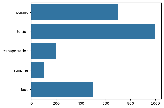
We will use the following lists:
expenses = ['housing', 'tuition', 'transportation', 'supplies', 'food']
cost = [700, 1000, 200, 100, 500 ]
color_set = ['y', 'r', 'g', 'orange', 'navy']
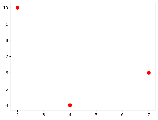
Scatterplot#
sns.scatterplot(x=[2,4,7],y=[10,4,6], color='r', s=100);
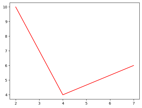
Lineplot#
sns.lineplot(x=[2,4,7],y=[10,4,6], color='r');
Barplot#
sns.barplot(x=cost, y=expenses);
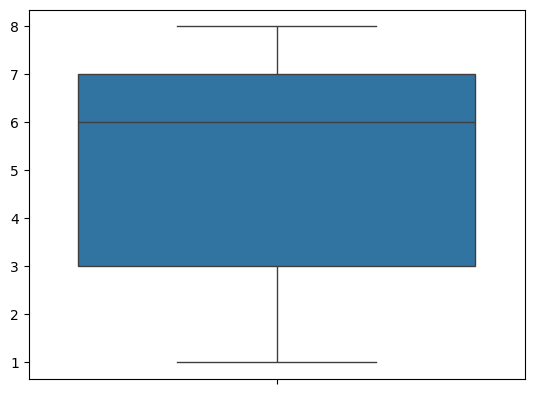
Box Plot#
sns.boxplot([8,7,3,2,1,5,6,7,8]);
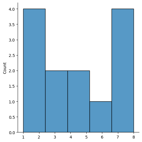
Displot#
sns.displot()is used to generate histograms.
sns.displot([8,7,3,2,1,5,6,7,8,1,3,2,5]);
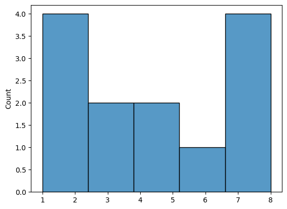
Histplot#
sns.histplot() is used to generate histograms.
sns.histplot([8,7,3,2,1,5,6,7,8,1,3,2,5]);
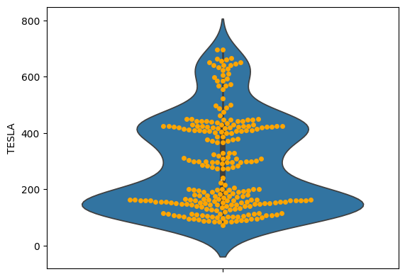
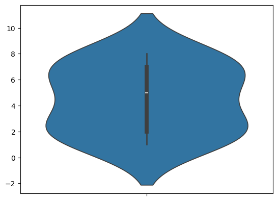
Violinplot#
sns.violinplot() is used to generate violinplots, which represent the distribution of the data.
sns.violinplot([8,7,3,2,1,5,6,7,8,1,3,2,5]);
Swarmplot#
sns.swarmplot() is used to generate swarmplots, which represent the distribution of the data.
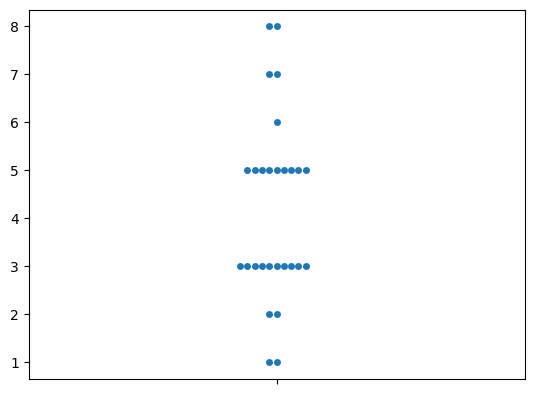
sns.swarmplot([8,7,3,2,1,5,6,7,8,1,3,3,3,3,3,3,3,3,3,2,5,5,5,5,5,5,5,5]);
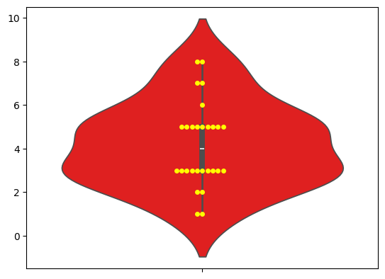
sns.swarmplot([8,7,3,2,1,5,6,7,8,1,3,3,3,3,3,3,3,3,3,2,5,5,5,5,5,5,5,5], c='yellow');
sns.violinplot([8,7,3,2,1,5,6,7,8,1,3,3,3,3,3,3,3,3,3,2,5,5,5,5,5,5,5,5], color='red');
DataFrames#
We will use the following dataset to perform visualization with Seaborn on a dataframe.
import pandas as pd
df_stock = pd.read_excel('https://raw.githubusercontent.com/datasmp/datasets/main/stock.xlsx')
df_stock.head()
| Date | APPLE | TESLA | AMAZON | VISA | SP500 | |
|---|---|---|---|---|---|---|
| 0 | 2020-01-02 | 74.33 | 86.05 | 1898.01 | 189.66 | 3257.85 |
| 1 | 2020-01-03 | 73.61 | 88.60 | 1874.97 | 188.15 | 3234.85 |
| 2 | 2020-01-06 | 74.20 | 90.31 | 1902.88 | 187.74 | 3246.28 |
| 3 | 2020-01-07 | 73.85 | 93.81 | 1906.86 | 187.24 | 3237.18 |
| 4 | 2020-01-08 | 75.04 | 98.43 | 1891.97 | 190.45 | 3253.05 |
import seaborn as sns
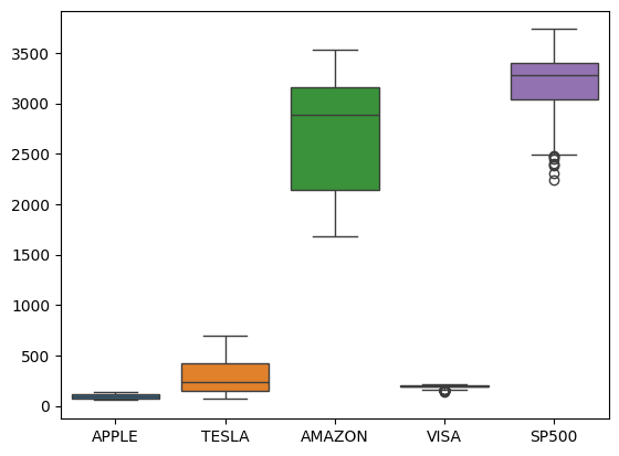
sns.boxplot(data=df_stock);
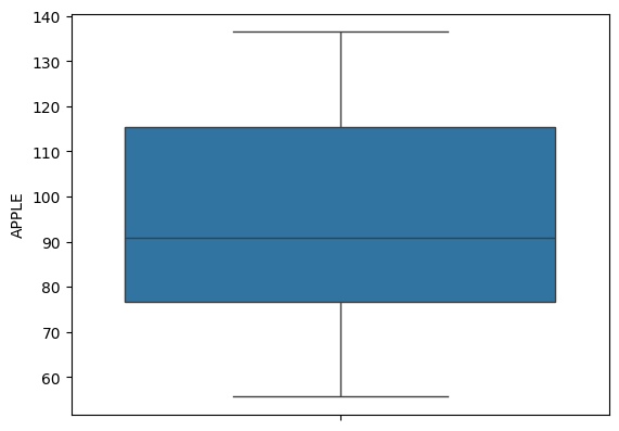
# apple
sns.boxplot(data=df_stock['APPLE']);
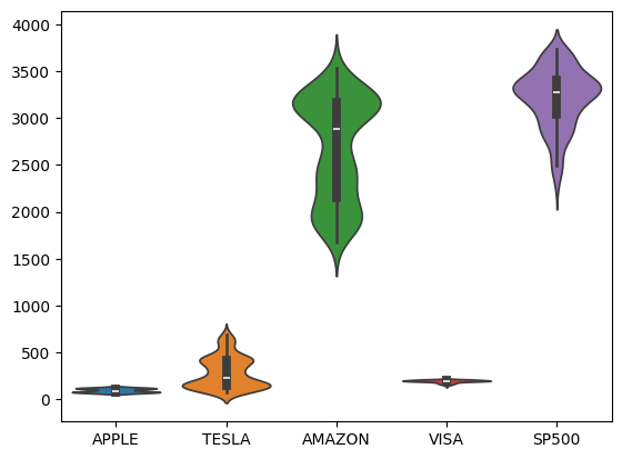
sns.violinplot(data=df_stock.iloc[:,1:]);
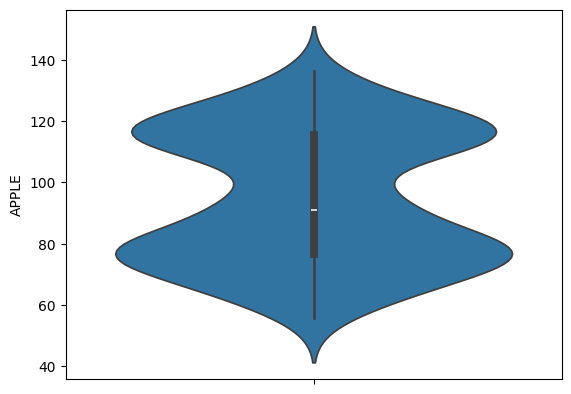
sns.violinplot(data=df_stock['APPLE']);
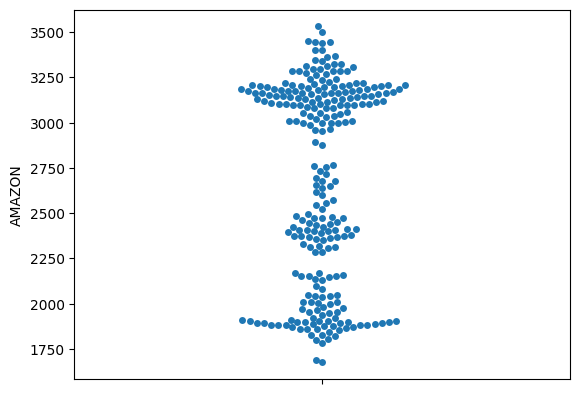
sns.swarmplot(data=df_stock['AMAZON']);
sns.violinplot(data=df_stock['TESLA']);
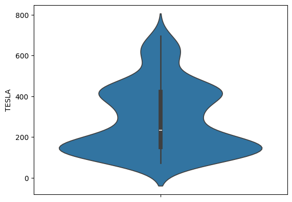
sns.violinplot(data=df_stock['TESLA']);
sns.swarmplot(data=df_stock['TESLA'], color='orange');