Visualization GO#
import plotly.graph_objects as go
import plotly.io as pio
pio.renderers.default = "png"
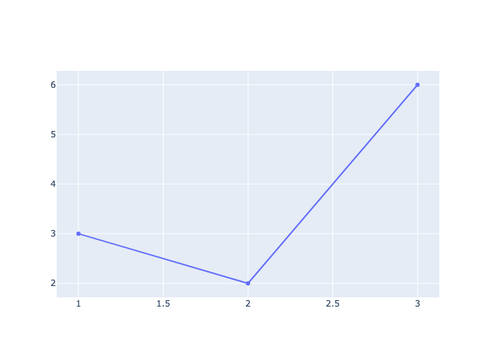
Line Plot#
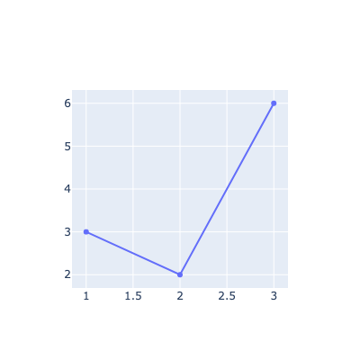
fig = go.Figure()

fig.add_trace(go.Scatter(x=[1, 2, 3], y=[3, 2, 6] ))
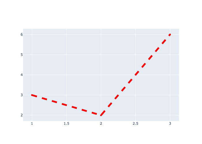
Line Width, Color, Style#
fig = go.Figure()

fig.add_trace(go.Scatter(x=[1, 2, 3], y=[3, 2, 6],line=dict(color='red', width=6, dash='dash')))
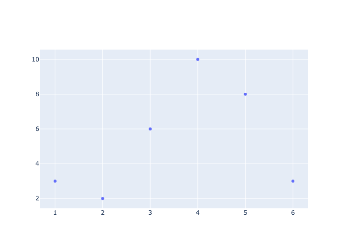
Scatter Plot#
fig = go.Figure()

fig.add_trace(go.Scatter(x=[1, 2, 3, 4, 5, 6], y=[3, 2, 6, 10, 8, 3], mode='markers'))
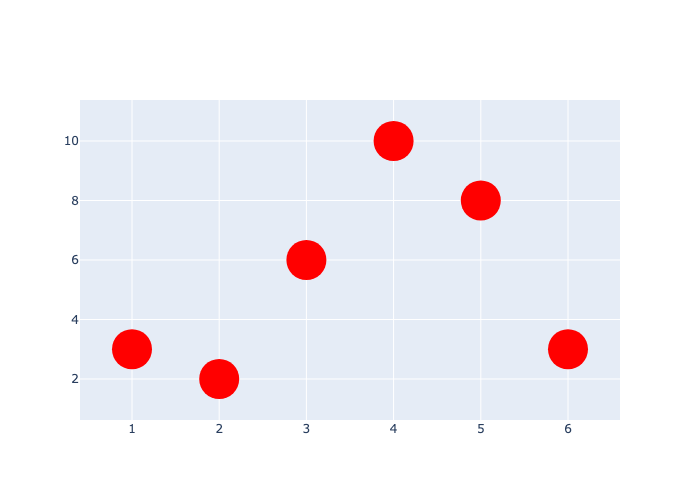
Marker Color and Size#
fig = go.Figure()

fig.add_trace(
    go.Scatter(x=[1, 2, 3, 4, 5, 6], y=[3, 2, 6, 10, 8, 3], mode='markers', marker=dict(color='red', size=40))
)
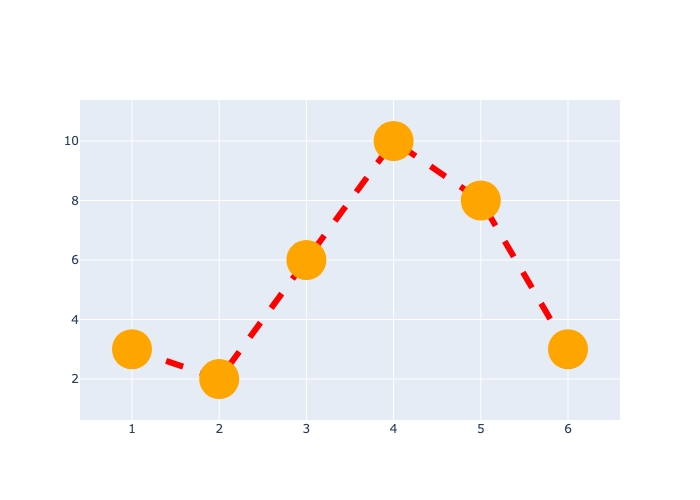
Line and Marker#
fig = go.Figure()

fig.add_trace(
    go.Scatter(x=[1, 2, 3, 4, 5, 6], y=[3, 2, 6, 10, 8, 3], mode='lines+markers', marker=dict(color='orange', size=40),
              line=dict(color='red', width=6, dash='dash'))
)
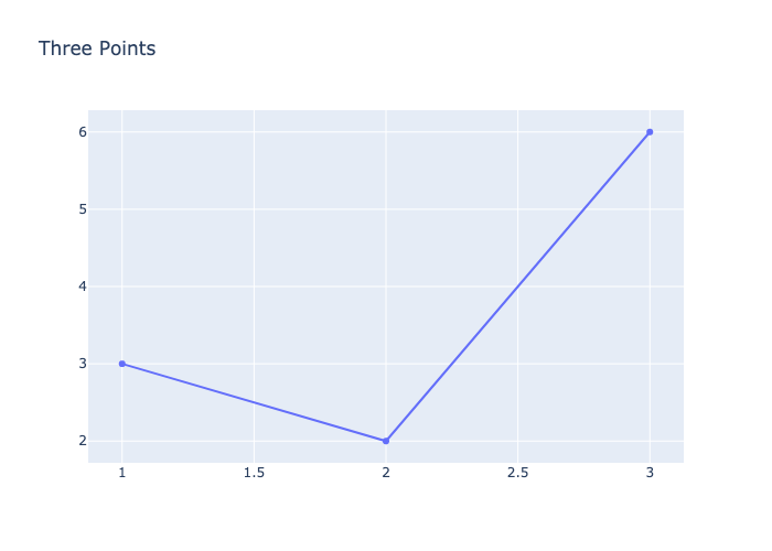
Title#
use update_layout()
fig = go.Figure()

fig.add_trace(go.Scatter(x=[1, 2, 3], y=[3, 2, 6]))

fig.update_layout(title='Three Points')
Axis Labels#
use update_layout()
fig = go.Figure()

fig.add_trace(go.Scatter(x=[1, 2, 3], y=[3, 2, 6]))

fig.update_layout(title='Three Points', xaxis_title='X-axis', yaxis_title='Y-axis')
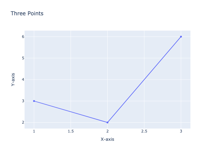
Figure Size#
Use update_layout()
fig = go.Figure()

fig.add_trace(go.Scatter(x=[1, 2, 3], y=[3, 2, 6]))

fig.update_layout(width=400, height=400)
Legend#
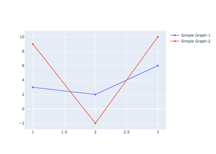
fig = go.Figure()

fig.add_trace(go.Scatter(x=[1, 2, 3], y=[3, 2, 6], name='Simple Graph-1'))
fig.add_trace(go.Scatter(x=[1, 2, 3], y=[9, -2, 10], name='Simple Graph-2'))

fig.update_layout(showlegend=True)
Pie Chart#
sizes = ['small','medium','large']
values = [300, 500, 400]
fig = go.Figure()
fig.add_trace(go.Pie(labels=sizes, values=values))
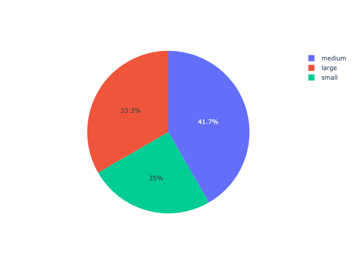
fig = go.Figure(data=[go.Pie(labels=sizes, values=values)])
fig.show()
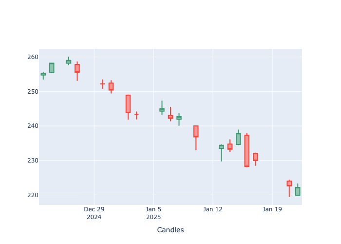
Candlestick#
import yfinance as yf
df = yf.Ticker('AAPL').history()
df.head()
| Open | High | Low | Close | Volume | Dividends | Stock Splits | |
|---|---|---|---|---|---|---|---|
| Date | |||||||
| 2024-12-23 00:00:00-05:00 | 254.770004 | 255.649994 | 253.449997 | 255.270004 | 40858800 | 0.0 | 0.0 |
| 2024-12-24 00:00:00-05:00 | 255.490005 | 258.209991 | 255.289993 | 258.200012 | 23234700 | 0.0 | 0.0 |
| 2024-12-26 00:00:00-05:00 | 258.190002 | 260.100006 | 257.630005 | 259.019989 | 27237100 | 0.0 | 0.0 |
| 2024-12-27 00:00:00-05:00 | 257.829987 | 258.700012 | 253.059998 | 255.589996 | 42355300 | 0.0 | 0.0 |
| 2024-12-30 00:00:00-05:00 | 252.229996 | 253.500000 | 250.750000 | 252.199997 | 35557500 | 0.0 | 0.0 |
fig = go.Figure()

fig.add_trace(go.Candlestick(x=df.index,open=df.Open,high=df.High,low=df.Low,close=df.Close,name='Apple'))

fig.update_layout(xaxis=dict(title='Candles',rangeslider=dict(visible=False)) )  # remove the second graph
Multiple Axis#
fig = go.Figure()
fig.add_trace(go.Scatter(x=[1,2,3,4,5], y=[1,3,2,5,4], name='same'))
fig.add_trace(go.Scatter(x=[1,2,3,4,5], y=[10,20,30,40,50], name='tens', yaxis='y2'))
fig.update_layout(
        yaxis=dict(title='Mulltiple Axis', side='left'),height=500,
        yaxis2=dict(overlaying='y',side='right',position=1,showgrid=False))
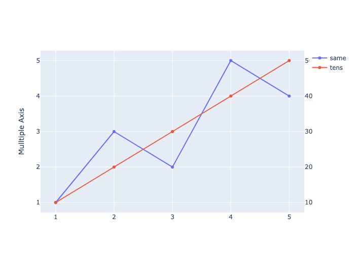
fig = go.Figure()
fig.add_trace(go.Scatter(x=[1,2,3,4,5], y=[1,3,2,5,4]))
fig.add_trace(go.Scatter(x=[1,2,3,4,5], y=[10,20,30,40,50], name='tens'))
fig.add_trace(go.Scatter(x=[1,2,3,4,5], y=[300,500,200,400,100], name='hundreds'))
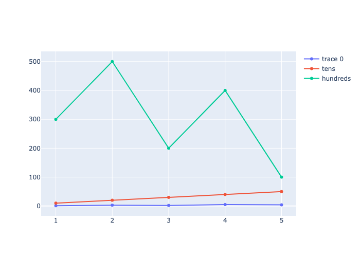
fig = go.Figure()
fig.add_trace(go.Scatter(x=[1,2,3,4,5], y=[1,3,2,5,4], name='ones'))
fig.add_trace(go.Scatter(x=[1,2,3,4,5], y=[10,20,30,40,50], name='tens', yaxis='y2'))
fig.add_trace(go.Scatter(x=[1,2,3,4,5], y=[300,500,200,400,100], name='hundreds', yaxis='y3'))
fig.update_layout(
        yaxis=dict(title='Mulltiple Axis', side='left'),height=700,
        yaxis2=dict(overlaying='y',side='right',position=1,showgrid=False),
        yaxis3=dict(overlaying='y',side='right',position=0.8,showgrid=False))
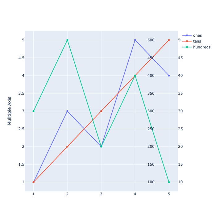
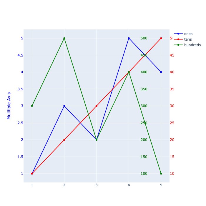
fig = go.Figure()
fig.add_trace(go.Scatter(x=[1,2,3,4,5], y=[1,3,2,5,4], name='ones', line=dict(color='blue')))
fig.add_trace(go.Scatter(x=[1,2,3,4,5], y=[10,20,30,40,50], name='tens', yaxis='y2', line=dict(color='red')))
fig.add_trace(go.Scatter(x=[1,2,3,4,5], y=[300,500,200,400,100], name='hundreds', yaxis='y3', line=dict(color='green')))
fig.update_layout(
        yaxis=dict(title='Mulltiple Axis', side='left', color='blue'),height=700,
        yaxis2=dict(overlaying='y',side='right',position=1, color='red', showgrid=False),
        yaxis3=dict(overlaying='y',side='right',position=0.8, color='green', showgrid=False))
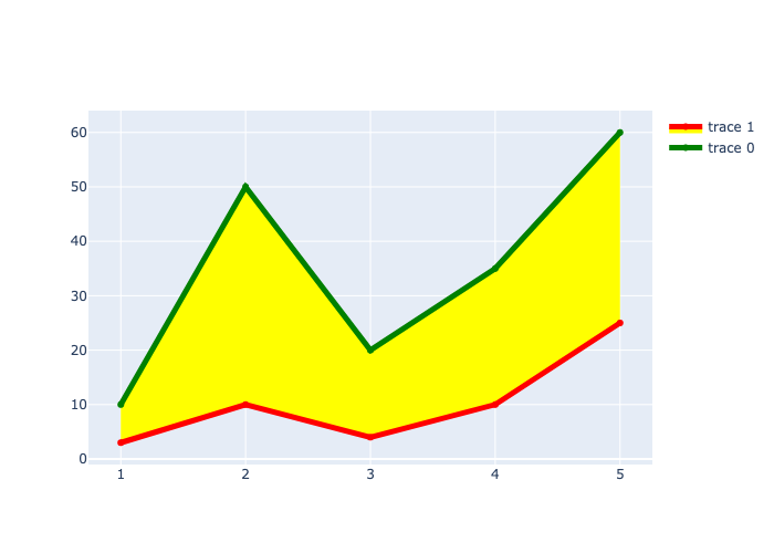
Area Between Lines#
Use the fill and fillcolor parameters
fill = ‘tozeroy’ fills the area between the line and the y-axis.
fill = ‘tonexty’ fills the area between the line and the next trace.
fig = go.Figure()

fig.add_trace(go.Scatter(x=[1,2,3,4,5], y=[10,50,20,35,60], fill='tozeroy',  fillcolor='green'))
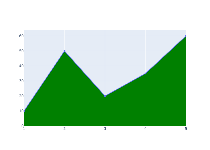
fig = go.Figure()

fig.add_trace(go.Scatter(x=[1,2,3,4,5], y=[10,50,20,35,60], line=dict(color='green', width=5)))
fig.add_trace(go.Scatter(x=[1,2,3,4,5], y=[3,10,4,10,25], line=dict(color='red', width=5), fill='tonexty',  fillcolor='yellow'))
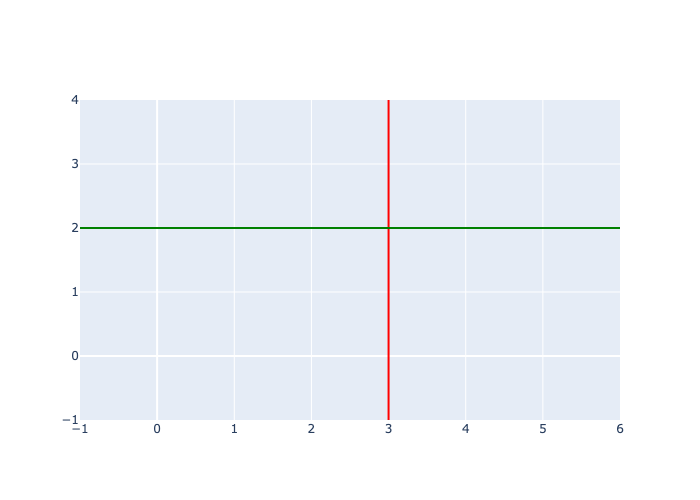
vline and hline#
fig = go.Figure()

fig.add_vline(x=3, line=dict(color='red'))
fig.add_hline(y=2, line=dict(color='green'))