Linear Regression#

Linear regression is used for regression tasks where the output is a continuous variable.
If the input data has only one feature, it is referred to as Simple Linear Regression.
When the input data has more than one feature, it is called Multiple Linear Regression.
This method does not have parameters that can be used for regularization.
Simple Linear Regression#
The input has only one variable.
The model is represented as: \(f(x)=ax+b\) where x is the input (feature).
The algorithm determines the coefficient (slope) \(a\) and the y-intercept (bias) \(𝑏\).
Linear regression finds the line that best fits (closest to) the data points.
The algorithm minimizes the sum of the squared differences (residuals) between the actual and predicted values.
import numpy as np
import matplotlib.pyplot as plt
np.random.seed(42)

x = np.linspace(0,1,20)
noise = np.random.randn(20)/3
y = 2*x+3+noise

x_train = np.array([x[i] for i in [1,4,6,14,18]])
y_train = np.array([y[i] for i in [1,4,6,14,18]])

from sklearn.linear_model import LinearRegression
lin_reg = LinearRegression()
lin_reg.fit(x_train.reshape(-1,1),y_train)
y_l = lin_reg.predict(x_train.reshape(-1,1))

for i in range(x_train.shape[0]):
  plt.plot([x_train[i],x_train[i]], [y_train[i], y_l[i]], 'r--')

plt.scatter(x_train,y_train, label='training', c='b')
plt.plot(x_train,y_l,label= 'linear model', c='orange', marker='o')
plt.title('Linear Model and Residuals', fontsize=20)
plt.legend();

In the figure above, the orange points represent the predicted values, while the blue points represent the actual values.
The red dashed lines represent the residuals.
Data With One Feature#
We will begin by working with the first 1,000 samples from the California Housing Dataset, followed by using the entire dataset.
from sklearn.datasets import fetch_california_housing
housing = fetch_california_housing()
Partial Data#
N = 1000
X = housing.data[:N,0]
y = housing.target[:N]
X.shape, y.shape
((1000,), (1000,))
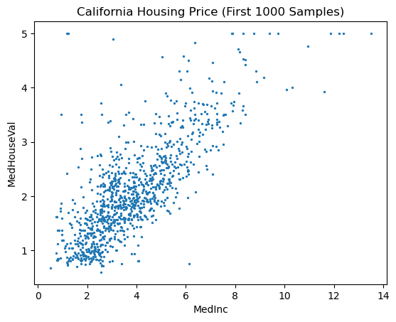
# scatter plot of MedInc vs MedHouseVal
import matplotlib.pyplot as plt
plt.scatter(X, y, s=2)
plt.xlabel('MedInc')
plt.ylabel('MedHouseVal')
plt.title('California Housing Price (First 1000 Samples)');
# train_test_split
from sklearn.model_selection import train_test_split
X_train, X_test, y_train, y_test = train_test_split(X, y, random_state=0)
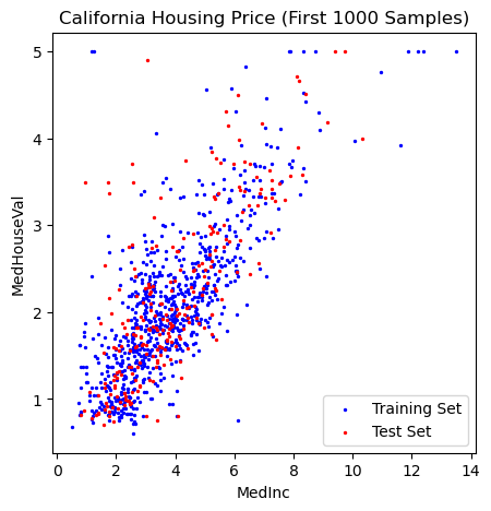
# plot training and test set
plt.figure(figsize=(5,5))
plt.scatter(X_train,y_train, label='Training Set', c='blue', s=2)
plt.scatter(X_test,y_test, label='Test Set', c='r', s=2)

plt.xlabel('MedInc')
plt.ylabel('MedHouseVal')
plt.title('California Housing Price (First 1000 Samples)')
plt.legend();
# fit model
from sklearn.linear_model import LinearRegression
lin_reg = LinearRegression()
lin_reg.fit(X_train.reshape(-1,1),y_train)
LinearRegression()In a Jupyter environment, please rerun this cell to show the HTML representation or trust the notebook.
On GitHub, the HTML representation is unable to render, please try loading this page with nbviewer.org.
LinearRegression()
# intercept
b = lin_reg.intercept_
b
0.6634359564195174
# coefficient
a = lin_reg.coef_
a
array([0.36823262])
# line x and y
import numpy as np
X_lin = np.linspace(0,15,100)
y_lin = a*X_lin+b
# plot training and test sets
plt.figure(figsize=(5,5))
plt.scatter(X_train,y_train, label='Training Set', c='blue', s=2)
plt.plot(X_lin, y_lin, label='Linear Model', c='orange')

plt.xlabel('MedInc')
plt.ylabel('MedHouseVal')
plt.title('California Housing Price (First 1000 Samples)')
plt.legend();

# training score
lin_reg.score(X_train.reshape(-1,1), y_train)
0.5903136483906415
# test score
lin_reg.score(X_test.reshape(-1,1), y_test)
0.574269787419049
Whole Data#
X = housing.data[:,0]
y = housing.target
X.shape, y.shape
((20640,), (20640,))
# train_test_split
from sklearn.model_selection import train_test_split
X_train, X_test, y_train, y_test = train_test_split(X, y, random_state=0)
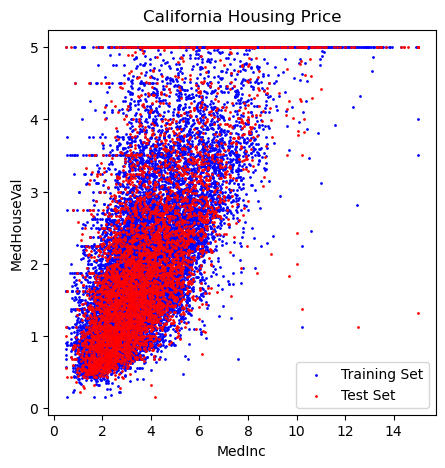
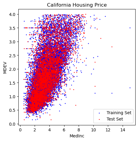
# plot training and test set
plt.figure(figsize=(5,5))
plt.scatter(X_train,y_train, label='Training Set', c='blue', s=1)
plt.scatter(X_test,y_test, label='Test Set', c='r', s=1)

plt.xlabel('MedInc')
plt.ylabel('MedHouseVal')
plt.title('California Housing Price')
plt.legend();
# fit model
from sklearn.linear_model import LinearRegression
lin_reg = LinearRegression()
lin_reg.fit(X_train.reshape(-1,1),y_train)
LinearRegression()In a Jupyter environment, please rerun this cell to show the HTML representation or trust the notebook.
On GitHub, the HTML representation is unable to render, please try loading this page with nbviewer.org.
LinearRegression()
# intercept
b = lin_reg.intercept_
b
0.43642774209170887
# ceoefficient
a = lin_reg.coef_
a
array([0.42273457])
# line x and y
import numpy as np
X_lin = np.linspace(0,10,100)
y_lin = a*X_lin+b
# plot training and test sets
plt.figure(figsize=(5,5))
plt.scatter(X_train,y_train, label='Training Set', c='blue', s=2)
plt.plot(X_lin, y_lin, label='Linear Model', c='orange')

plt.xlabel('MedInc')
plt.ylabel('MedHouseVal')
plt.title('California Housing Price')
plt.legend();
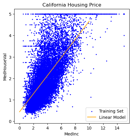
# training score
lin_reg.score(X_train.reshape(-1,1), y_train)
0.48061930819884535
# test score
lin_reg.score(X_test.reshape(-1,1), y_test)
0.4512591462254416
Restricted Data#
In this section, we will work with the samples where the output value (MedHouseVal) is less than 4.
#Restrict the data to y<4, y_r
y_r = y[y < 4]
y_r.shape
(18869,)
# X_r
X_r = X[y < 4]
X_r.shape
(18869,)
# train test split
Xr_train, Xr_test, yr_train, yr_test = train_test_split(X_r, y_r, test_size=0.33, random_state=42)
# plot training and test set
plt.figure(figsize=(5,5))
plt.scatter(Xr_train,yr_train, label='Training Set', c='blue', s=1)
plt.scatter(Xr_test,yr_test, label='Test Set', c='r', s=1)

plt.xlabel('MedInc')
plt.ylabel('MDEV')
plt.title('California Housing Price')
plt.legend();
# fit the model
lin_reg = LinearRegression()
lin_reg.fit(Xr_train.reshape(-1,1),yr_train)
LinearRegression()In a Jupyter environment, please rerun this cell to show the HTML representation or trust the notebook.
On GitHub, the HTML representation is unable to render, please try loading this page with nbviewer.org.
LinearRegression()
# coefficient
a = lin_reg.coef_
a
array([0.36193269])
# intercept
b = lin_reg.intercept_
b
0.5186136742943914
# line x and y
Xr_lin = np.linspace(0,10,100)
yr_lin = a*Xr_lin+b
# plot training and test sets
plt.figure(figsize=(5,5))
plt.scatter(Xr_train,yr_train, label='Training Set', c='blue', s=2)
plt.plot(Xr_lin, yr_lin, label='Linear Model', c='orange')

plt.xlabel('MedInc')
plt.ylabel('MedHouseVal')
plt.title('California Housing Price (Restricted)')
plt.legend();
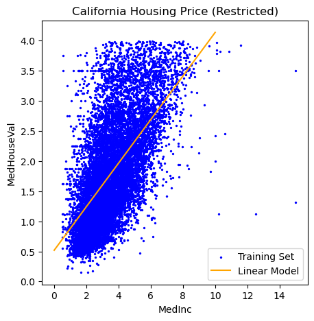
# training score
lin_reg.score(Xr_train.reshape(-1,1), yr_train)
0.40022465127685924
# test score
lin_reg.score(Xr_test.reshape(-1,1), yr_test)
0.40664648139678006
Multiple Linear Regression#
The input has more than one variable (feature).
If there are two features \(x_1\) and \(x_2\), the model is represented as: \(f(x)=a_1x_1+a_2x_2+b\).
The algorithm determines the coefficients (slopes) \(a_1, a_2\) and the y-intercept (bias) \(𝑏\).
Linear regression finds the hyperplane that best fits (closest to) the data points.
The algorithm minimizes the sum of the squared differences (residuals) between the actual and predicted values.
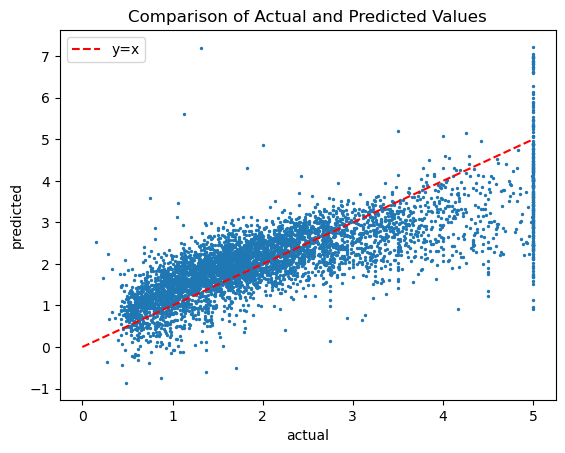
Data With All Features#
X = housing.data
y = housing.target
All 8 features will be included in the input data.
X.shape, y.shape
((20640, 8), (20640,))
X_train, X_test, y_train, y_test = train_test_split(X, y, random_state=0)
# fit the model
lin_reg = LinearRegression()
lin_reg.fit(X_train,y_train)
LinearRegression()In a Jupyter environment, please rerun this cell to show the HTML representation or trust the notebook.
On GitHub, the HTML representation is unable to render, please try loading this page with nbviewer.org.
LinearRegression()
# intercept
b = lin_reg.intercept_
b
-36.609593778714135
# coefficients
a = lin_reg.coef_
a
array([ 4.39091042e-01,  9.59864665e-03, -1.03311173e-01,  6.16730152e-01,
       -7.63275197e-06, -4.48838256e-03, -4.17353284e-01, -4.30614462e-01])
# coefficient shape
a.shape
(8,)
# training score
lin_reg.score(X_train  , y_train )
0.6109633715458153
# test score
lin_reg.score(X_test  , y_test )
0.5911695436410482
# actual vs predicted scatter plot
plt.scatter(y_test ,lin_reg.predict(X_test  ), s=2)
plt.plot([0,5],[0,5], 'r--', label='y=x')
plt.title('Comparison of Actual and Predicted Values')
plt.xlabel('actual')
plt.ylabel('predicted')
plt.legend();
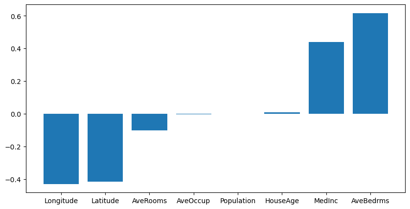
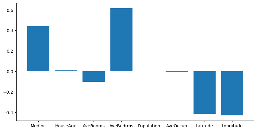
Coefficients#
# coefficients in a bar graph
plt.figure(figsize=(10,5))
plt.bar(housing.feature_names, lin_reg.coef_);
sorted = np.argsort(lin_reg.coef_)
sorted
array([7, 6, 2, 5, 4, 1, 0, 3])
housing.feature_names
['MedInc',
 'HouseAge',
 'AveRooms',
 'AveBedrms',
 'Population',
 'AveOccup',
 'Latitude',
 'Longitude']
np.array(housing.feature_names)[sorted]
array(['Longitude', 'Latitude', 'AveRooms', 'AveOccup', 'Population',
       'HouseAge', 'MedInc', 'AveBedrms'], dtype='<U10')
lin_reg.coef_[sorted]
array([-4.30614462e-01, -4.17353284e-01, -1.03311173e-01, -4.48838256e-03,
       -7.63275197e-06,  9.59864665e-03,  4.39091042e-01,  6.16730152e-01])
# sorted coefficients in a bar graph

plt.figure(figsize=(10,5))
plt.bar(np.array(housing.feature_names)[sorted], lin_reg.coef_[sorted]);